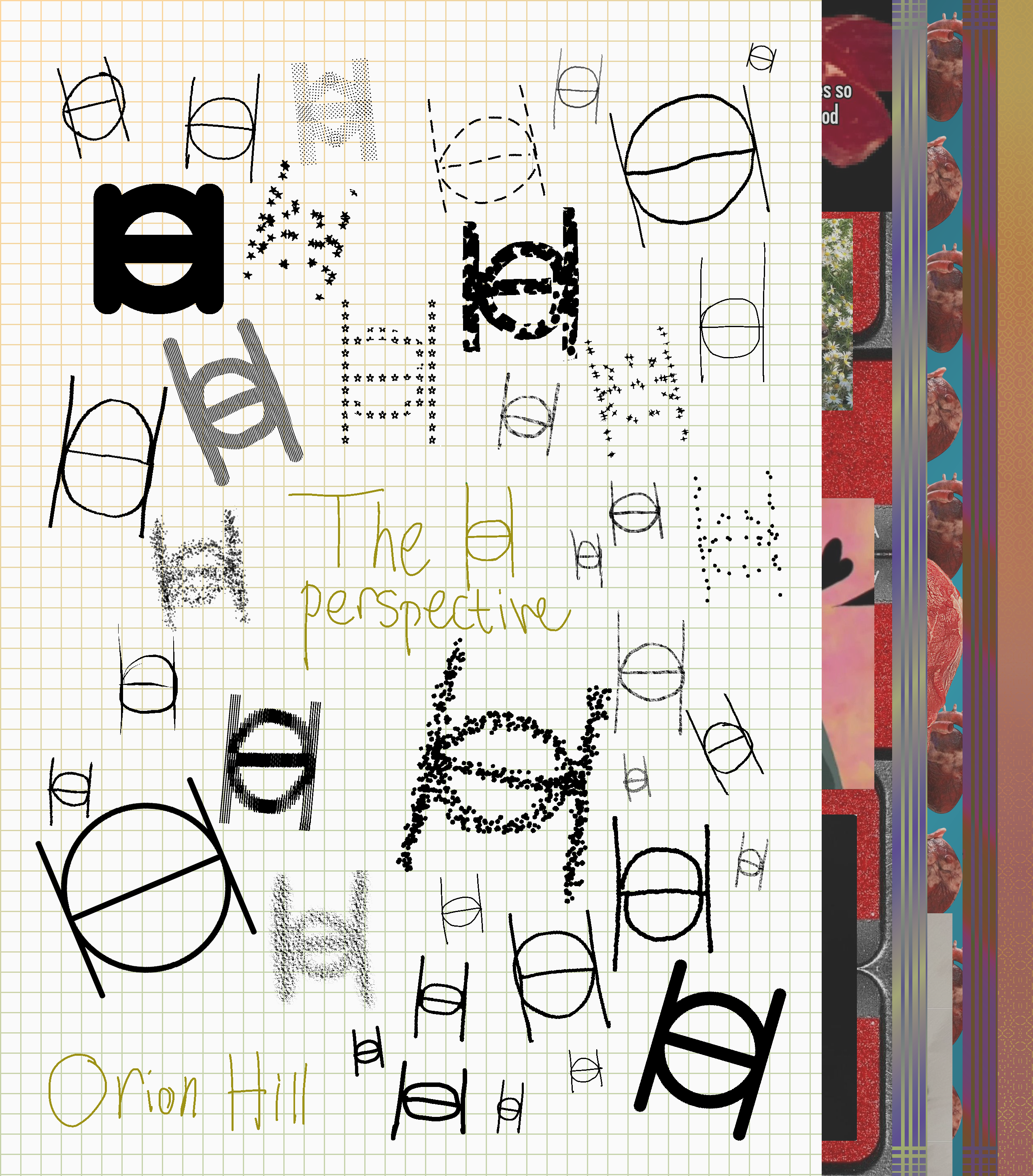
This was done for my Art History II class with Samantha Neu. The project was to create your own art movement with doctrines and a manifesto to match. I chose to show how I view art for the project- if it is made by human hand, it is art. I had to hand in a physical component for the project as well so I tried to make my very first zine, which led to this twenty-six page try!
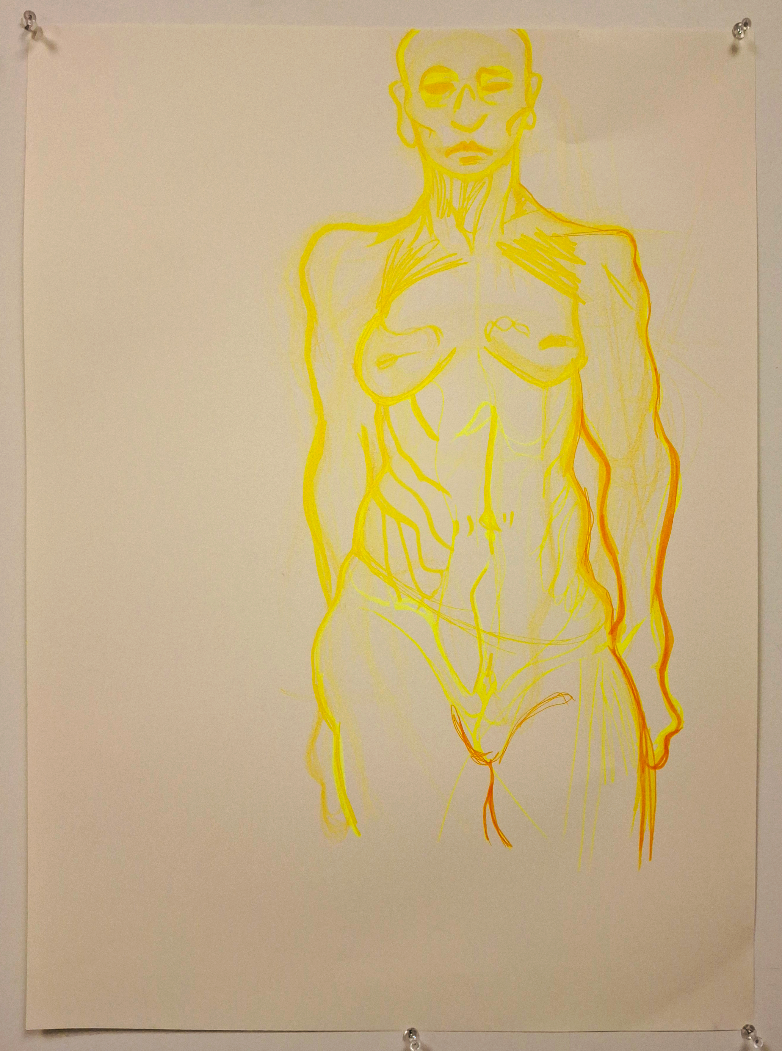
The use of color in this piece was applied, via a happy accident, to simulate a more shadowed end result. I have found that using highlighters to sketch out my figures before going over them with darker markers toward the lower right area. I like seeing the sketch from underneath the ‘final’ image. This piece was a bigger version of a Morpho drawing.
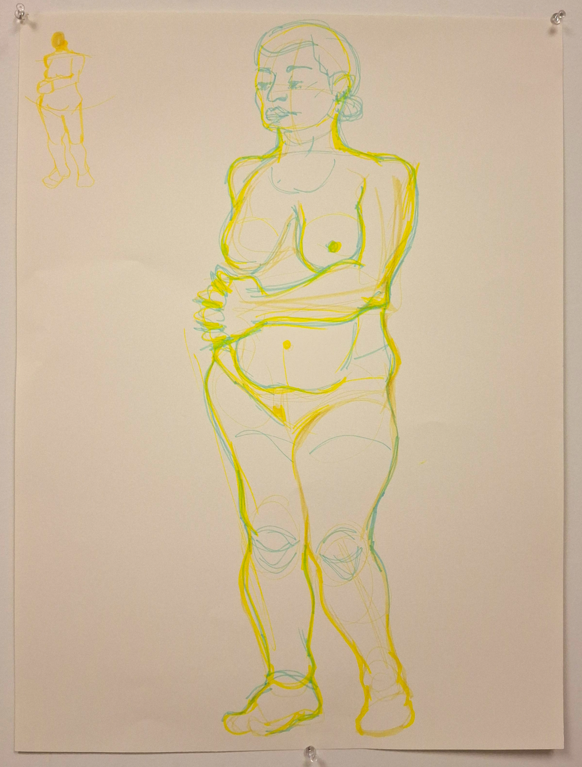
This piece was done in Figure Drawing II with a new model. I have been experimenting with markers this semester since I know the materials extremely well, and I missed having color in my art pieces. I am always looking to refine my figure studies and knowledge of the human body in art. My professor, Mel Tychonievich, suggested that I do a thumbnail of the pose to work out the tremors in my hands on the first run.
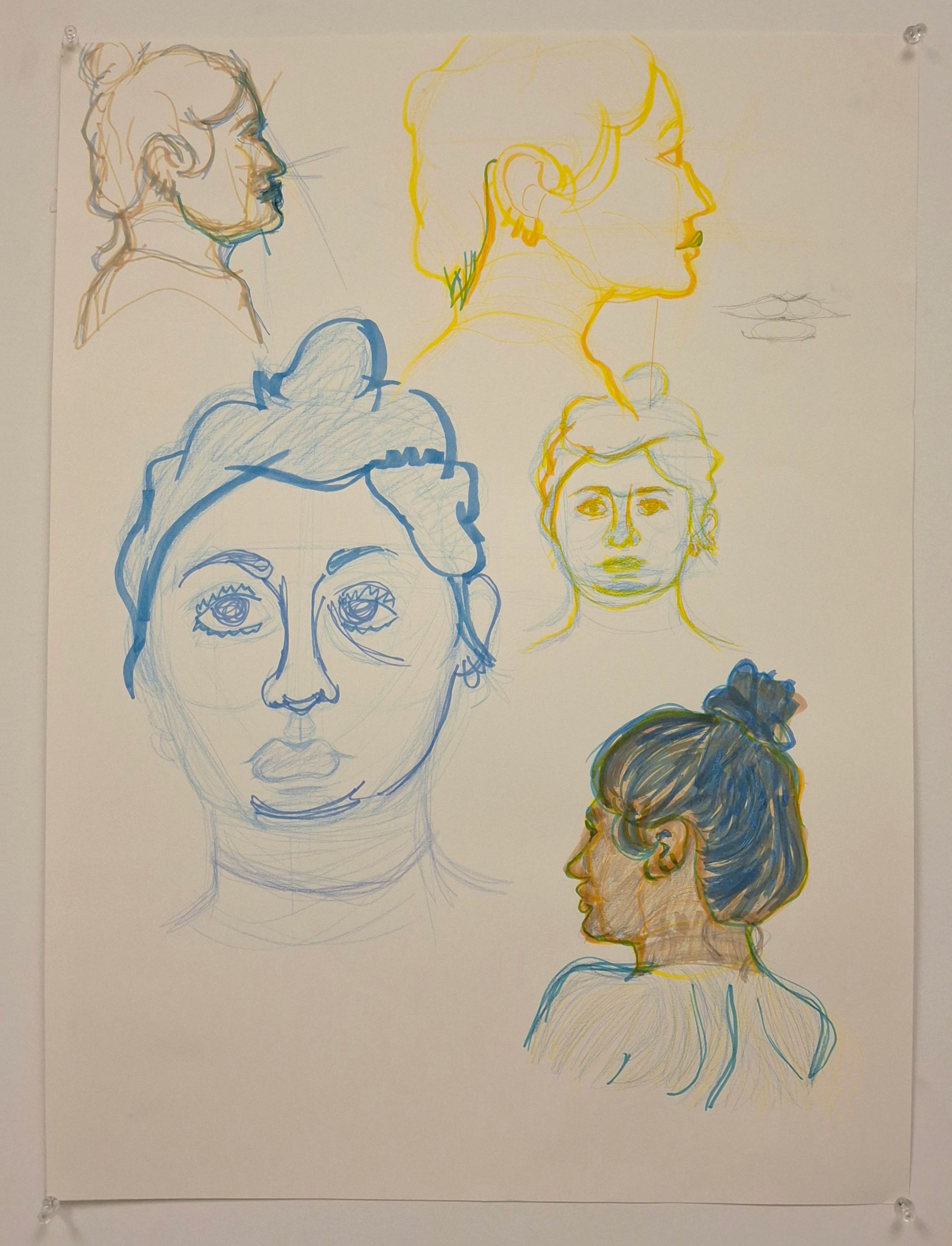
I asked my Figure Drawing professor, the aforementioned Mel, suggested submitting pieces that had tonal variations and chroma differences. While I am unsatisfied with the blue head, the combo busts of yellow and blue turned out well. I am happy with how the brassy sketch comes through for the upper left, I am very satisfied with the yellow head since it almost feels like it glows. The blue pencil and yellow marker head ended up okay, and the bottom right piece was more of an exploration of the colors at my disposal.
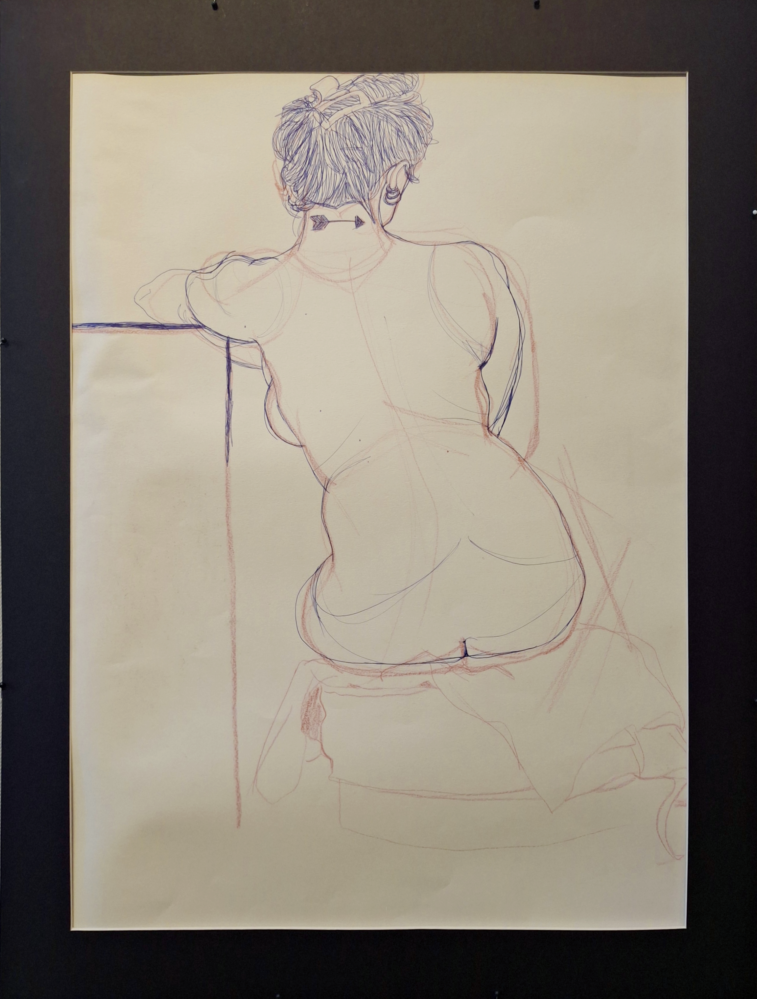
Another Mel Tychonievich class, yay! The model is the same as the previous two pieces. This was part of my 'every two weeks is another color combination' classwork. The first combination was orange and green {wow}, then yellow and cyan, pink and purple, then red and blue. This was done in one session and I am proud to have gotten the smaller details such as freckles, tattoos, and direction of the hair. I feel this also exemplifies what I tend to focus on in figurative work, that being the shape and weight of the body. It also shows that I like to have the sketch show from udnerneath in figure art. I had also done the stool after the figure and I think the fabric layers turned out alright.
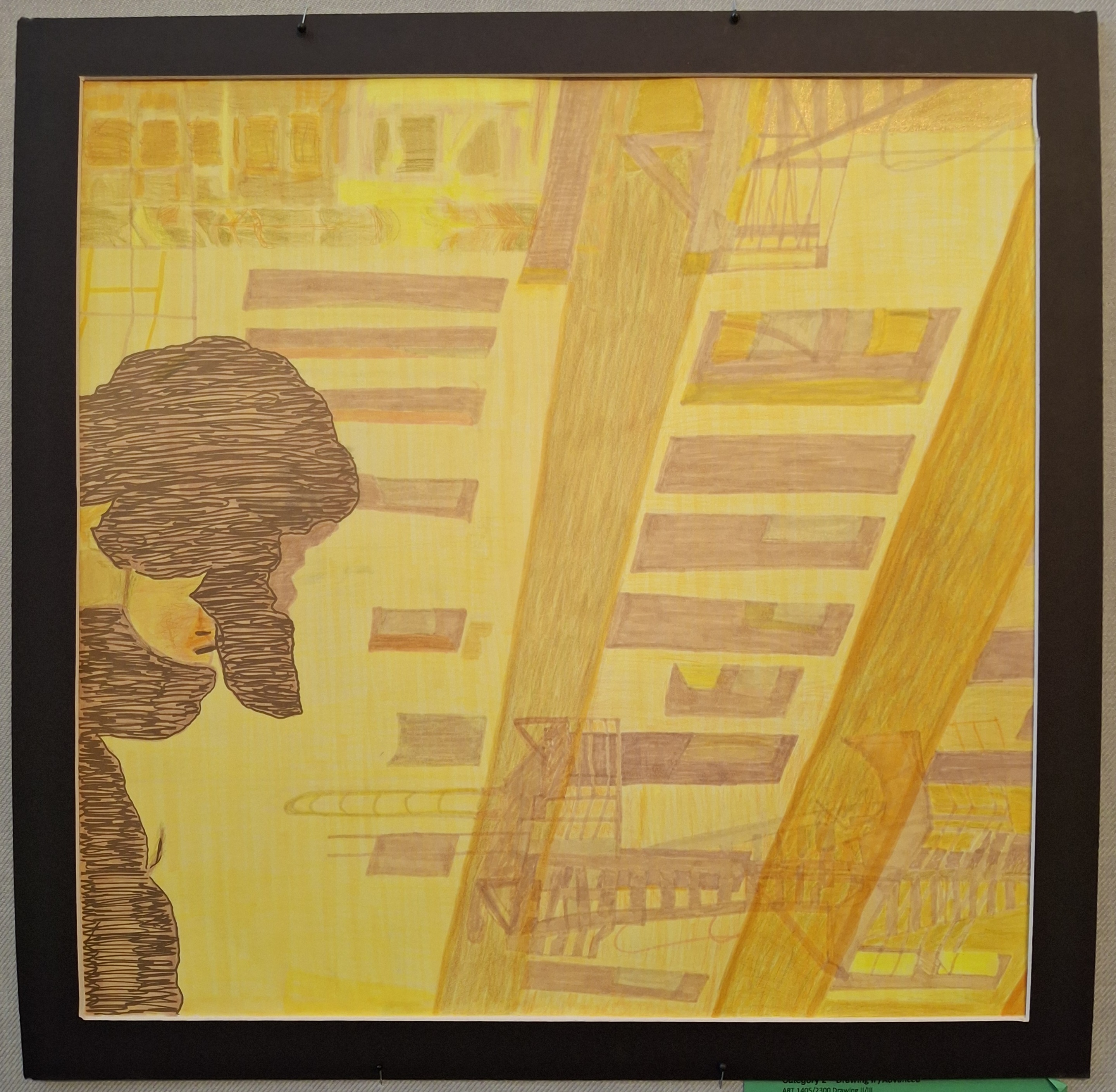
"Yellow Square" has been the only way I have been referring to this piece. Partially because it was funny, part because this was my first attempt at resizing an image with a grid, so my paper was just a sheet of yellow with a grid on top. I had sketched the grid lines in marker {using a lighter yellow of course} and wanted to keep the messy and sketchy quality of the marker medium.
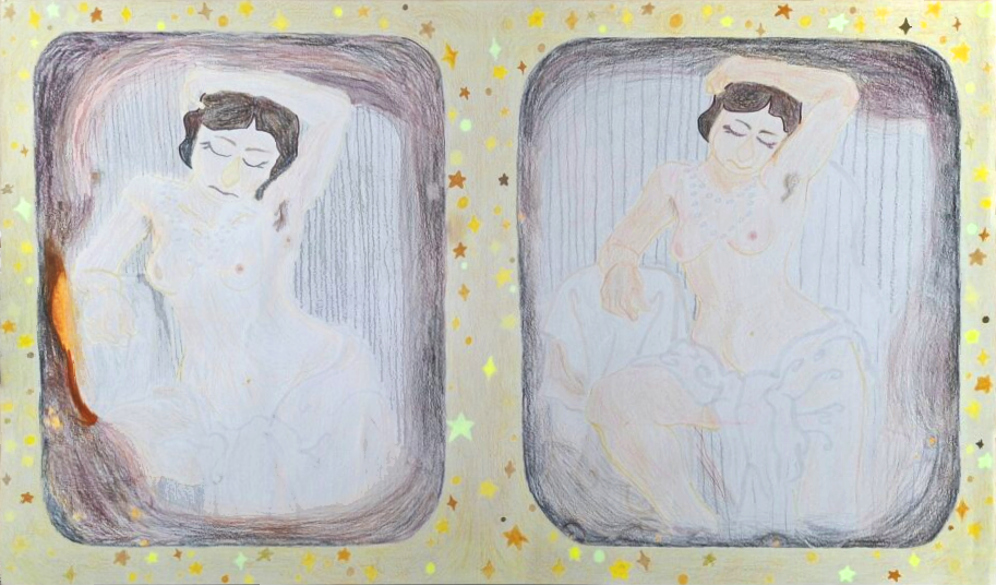
This was an assignment by Raymond Hummel called 'Cover Song'; You were to take an art piece and do a master copy in your own style. Part of the assignment was to research the artist but since the photographer and model behind this piece were undocumented, I pivoted to talk about a brief history of photography. The original was a daguerreotype! The hardest part was the age spots of the original. The left square was my 'test zone' so the right square was where I was comfortable. I am glad to have done this piece partially to show my use of colored pencil and marker, but the composition was so interesting that it drew me in the first place. Also, this was my first attempt at forcing myself to do the unavoidable: fabric. I prefer to stylize clothing folds with the wispy edges so this was good practice.
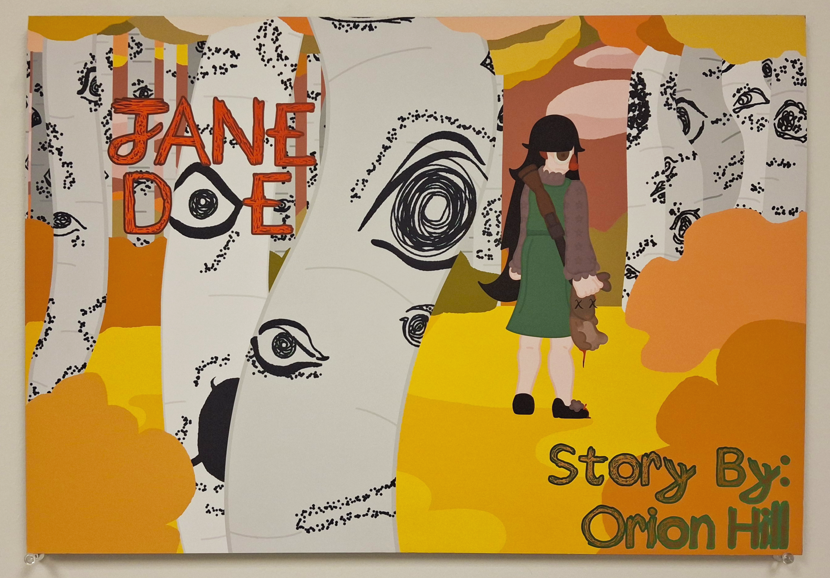
This piece was for an assignment in Illustration & Sequential Design- after making my character, Jane Doe, we were told to make a concept art piece to show off the character and story. I chose to show Jane in a forest holding a rabbit she shot with the gun on her back with wide eyes. She isn’t smiling to show that she has a very creepy atmosphere around her. Jane is also staring directly at the viewer to unsettle the audience. The reason yellows, pinks, and oranges were chosen was to show that this series, while being set in Missouri, won’t exactly be realistic to the furthest extreme. Jane is a cannibal who eats her crushes, but the cartoon style pairs well with the pink sky and clouds. The rabbit has X’s over the eyes and blood dripping from its body to remind that this will be a gory story.
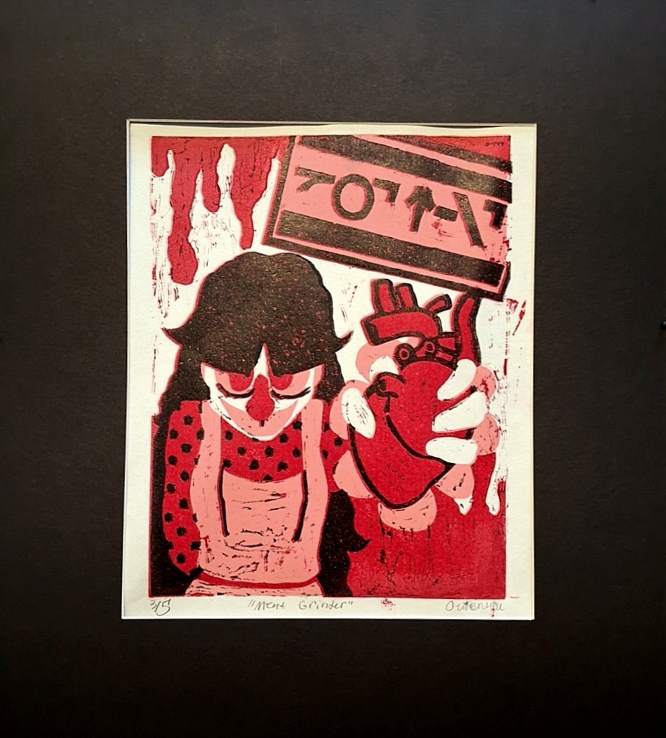
"Meat Grinder" is a piece that was sketched with pencil, cleaned up digitally, flipped-slalsh-printed, and then transferred onto the linoleum block seen below via frottage. It depicts Jane holding a realistic-shaped human heart out at arm’s length toward the viewer, with a sign in the back reading “GOT MEAT”. It was done in layers of white, pink, red, in black. The sign was modeled after parental advisory signs.
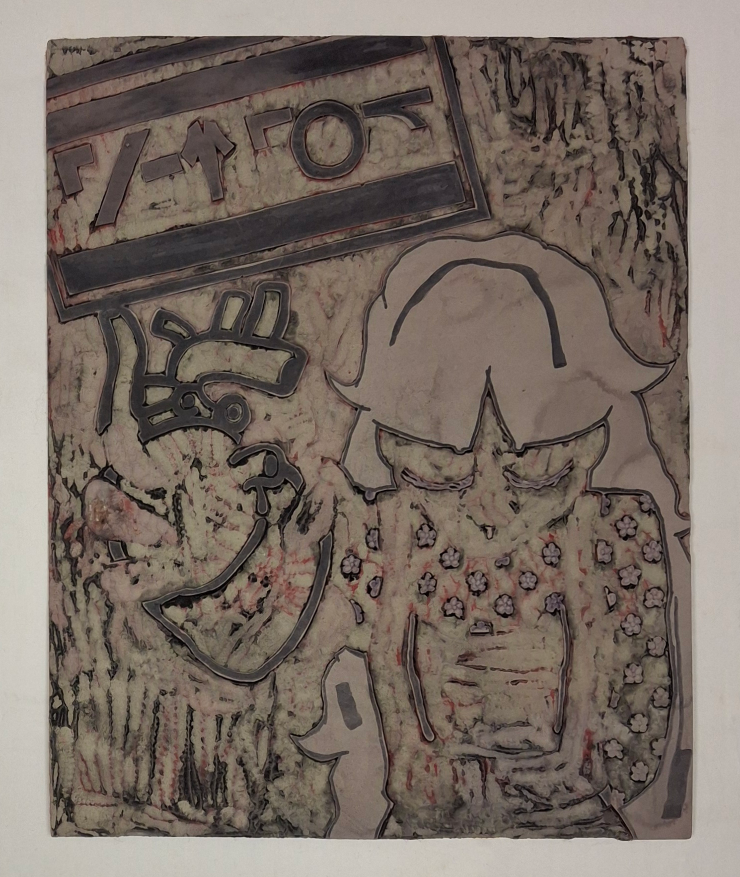
“Meat Grinder, Linoleum” is the linoleum left over from my “Meat Grinder” prints. Why show a linoleum block? It still holds the same artistic intent and landing as the piece it created, and seeing the ‘in progress’ of art is always a treat. I am proud that the layers are still technically visible even after being carved, washed, and reprinted. I find that showing the in-process aspect of art just as important as showing the finished product. It makes art seem 'more real', as if the imaginary wall seperating an artist from someone who looks at art lifts for a brief respite. Also, here is the digital sketch that I had printed and transfered onto the linoleum! I think the grit of the printing process really helped "Meat Grinder" stand out.
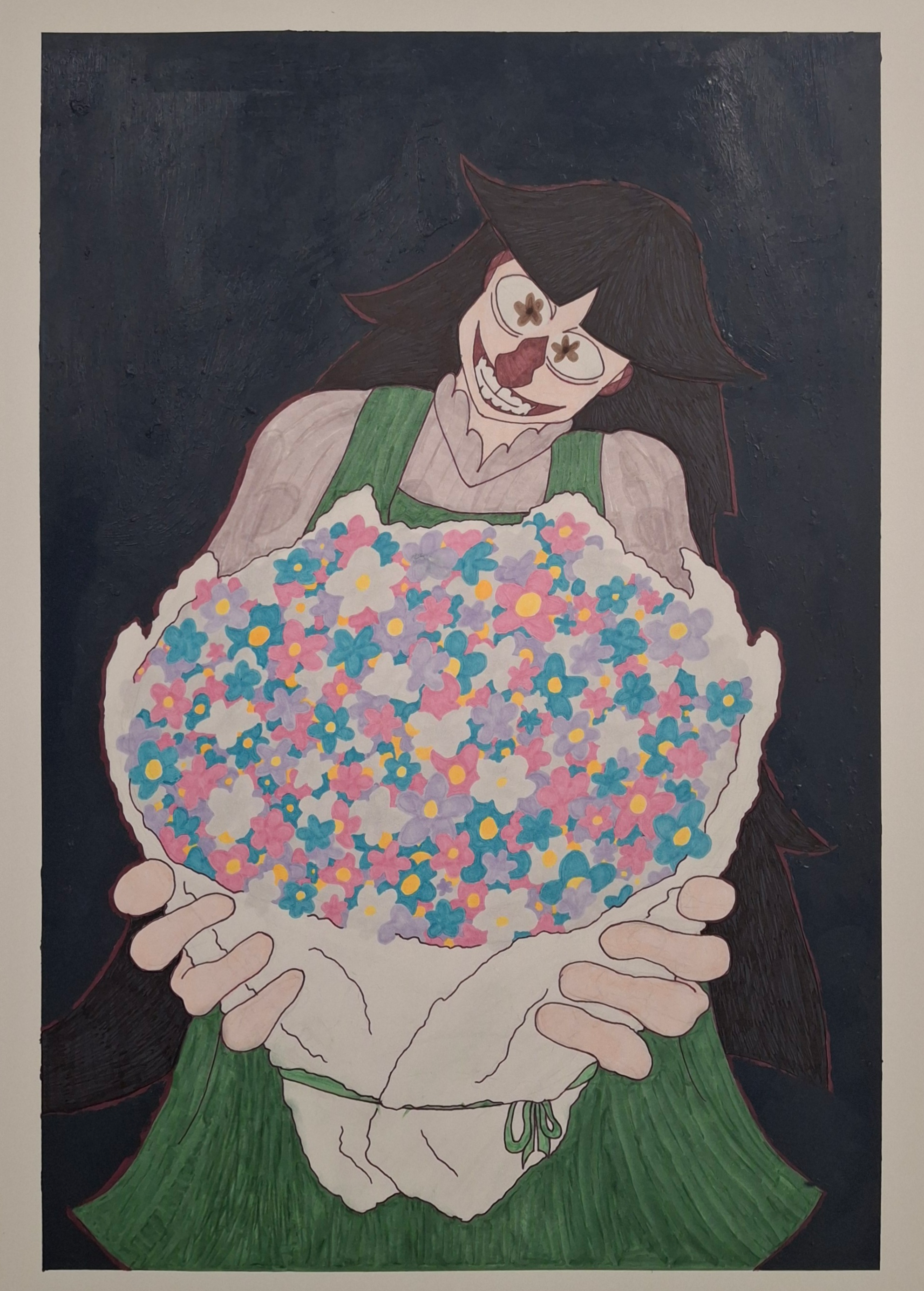
This one has so far been untitled. The story for this in my head is that Jane's final boyfriend and most compatible match, Cypress, is being handed flowers even though he... Works as a florist making bouquets. Cypress does like the gift, though, because he likes Jane. The background color is has a specific name: eigengrau. It has other names like 'grain gray' because this is the color constructed when the human eye is closed in a dark room. It is not completely black but instead just a dark navy. The next time you are in a dark area try closing your eyes and focusing on the back of your eyelids! Putting your hands over your eyes may help as well.
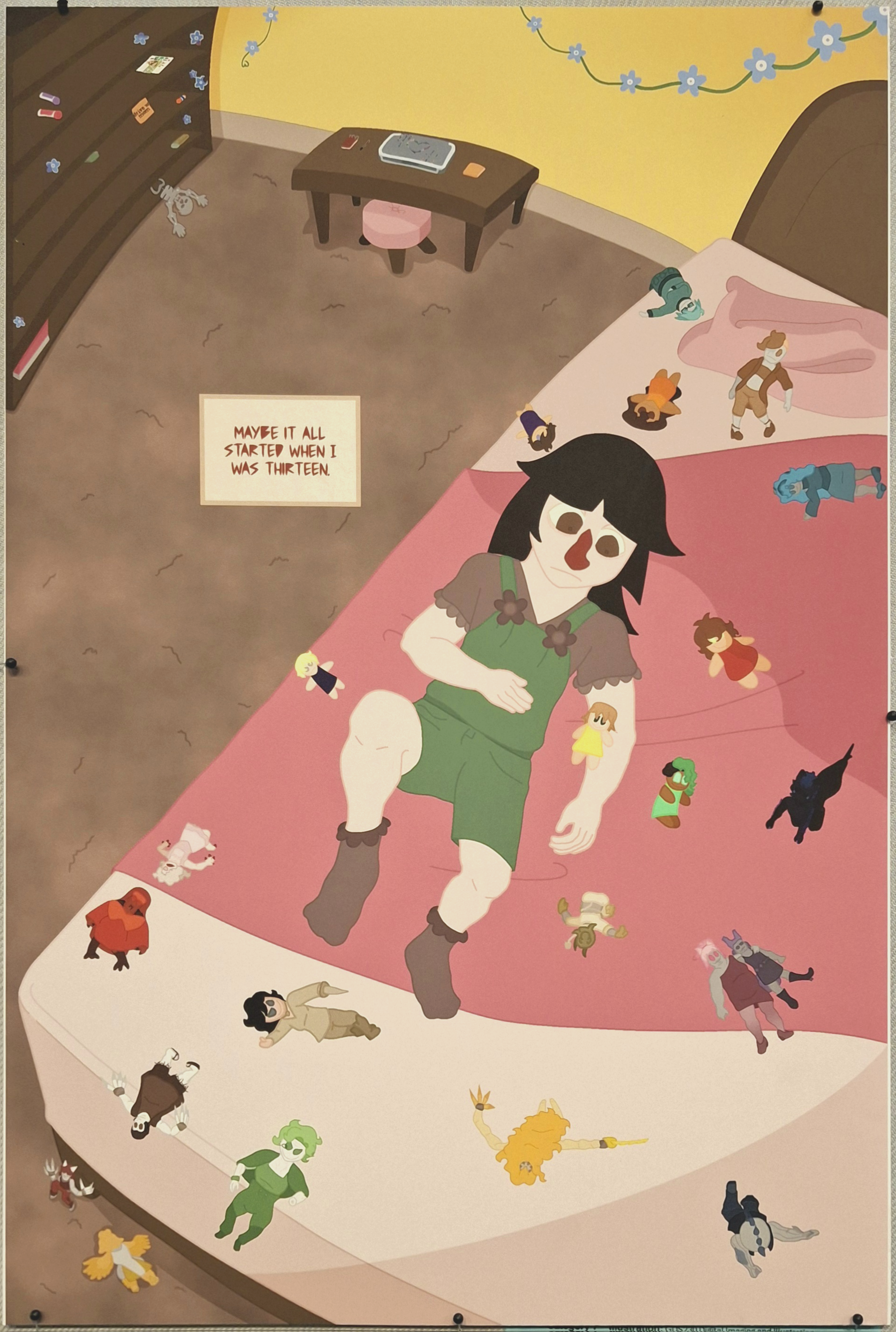
I am saddened that this piece does not photograph well, but there will be an alternative digital version linked here. This piece took me forever on account of the dolls. So many dolls. I chose to do that, though, so that's on me. The computer bedazzling was something unplanned and I ended up doing it in an afternoon. Planned the design, the shapes and colors of the gems, and the perspective on them. Speaking of perspective I would really like to redo this room now that I know what I want. This was a single page from a comic for Illustration & Sequential Design class with Brandon Daniels. The rest of the {unfinished} comic is a 'not right now' goal for when I have time. But here is the other finished page from the exposition comic! This is another page I would like to redo. Really, I want to redo the entire exposition I think but I am satisfied with this page.